or call 404-492-7567 voice,
or ping @jcburns on twitter, instagram, flickr…
 Interface
 A gallery of interactivity
Chyron Infinit UI
1989
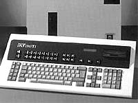
The Chyron Infinit became a standard in Chyron‘s long line of television character generators...their first CG with a GUI.


After success with their Chyron IV through the 70s and much of the 80s, and after introducing the Chyron Scribe—their first CG with antialiased, vector-based, ‘real‘ typefaces—they decided to pull together everything they knew and develop a system that would finally retire the venerable Chyron IV from hundreds of control rooms and remote trucks.
Roi Agneta, Chyron‘s then-VP of Engineering, contacted me about pulling together some design ideas for the system‘s user interface—the screen that would face the operator as they sat in the control room, composing and recalling pages of text and graphics. Although the era of the graphical user interface was well underway on desktop personal computers, in the control rooms of television, most computer-based systems—DVEs, editors, and CGs—did not run on Mac OS, Windows, Linux, or anything else. The way that systems accessed storage on disk and moved cursors and elements on the screen had to be developed from scratch. There were very few precedents or guidelines.
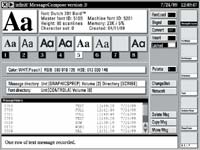
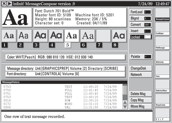
I sat down with the prototyping tools of the era—at least, the tools available to someone with a then-state-of-the-art Macintosh Plus—HyperCard (!)—and came up with a screen display gave the operator as much ‘heads-up‘ information as possible, showing a row of loaded fonts, a status line at the bottom, a row of commands in a column one in from the right side of the screen, and a column of icons representing the subprograms that madeup the whole Infinit system. One consideration I tried to keep in mind: even though the Infinit came equipped with a mouse, in most control rooms the keyboard (and the operator) for the CG is crammed in amidst a lot of other equipment (and people.) As far as some of the other concerns, I wrote Agneta:
When an operator is setting pages up, moving things around, making precise adjustments, or describing complex animation moves or mixes or effects to the machine—the mouse may well make things easier. But during a live show—the user will probably want a good reason to take his/her hands off the keys.
So...should there be cutesy icons? Um...a few, I think. Icons are good ways to indicate—in shorthand—things like ‘use this edge treatment’ or ‘this way to the 3D program’—but I think most functions that do something concrete like deleting or moving should be represented by buttons—visual extensions to the keyboard that have control or alt-key equivalents—written in plain English.
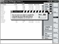
Should there be multiple windows? ‘Yes, sorta,’ is my early opinion. I think it’s useful to have secondary windows that pop up with dialogs with the user (such as ‘Do you really want to blow this disk to smithereens?’) or with the list of Control functions when the user hits the CNTL key, but I feel (at this early stage of the game) that the back, main window that gets things done in an operating program, that displays the loaded fonts and has the icons representing other programs and the like—should be basically fullscreen, unmoving, perhaps divided into ‘panes’ or segments—but, for the most part, devoted to providing information in predictable and familiar places no matter whether the user is in the disk utility or message compose or whatever.
We made good progress in the back-and-forth of design and redesign through the fall, but then the staff at Chyron suffered a huge setback, when the programming lead was involved in a vehicle accident and ended up hospitalized for an extended period. With an inflexible deadline looming the next April for the NAB, grand plans went out the window, and the Infinit shipped with an OS and interface that were, shall we say, slightly cobbled-together. I can still recognize a lot of what I came up with in the finished product, but you always wish for more...y‘know?
Early Message Compose interface design, created in Aldus Freehand 2.0.
