or call 404-492-7567 voice,
or ping @jcburns on twitter, instagram, flickr…
 Print
Print
From poster-sized to CD-sized.
Print design
At the moment ink (or toner) hits paper, design work becomes, by definition, high-definition.


The total number of bits in a standard def NTSC television image, if reproduced at good quality on the printed page, would result in a tiny image—2.4 inches by 1.62 inches. Even a 1080i high-def image only amounts to a paltry 6.4 by 3.6 inches...the size of an envelope.
So when you're talking posters or full-page graphics, you're talking big files. And when you're talking color reproduction, printing with four colors or six colors or a custom mix of inks, it helps to know the ins and outs of color spaces, the Acrobat PDF format, vectors, bitmaps, and how colors change when reproduced on, say, a huge piece of shiny vinyl vs. a matte business card.
Or, you could ignore it all and just crank out haphazard desktop graphics in Microsoft Word with as many different typefaces as there are words and ship it off to Kinko's and hope for the best.
But...as I so often say, good design is good communication, and if your mission is to communicate...clearly, consistently, and with style, I'd like to recommend talking to an actual no kidding designer...like me.
Some of my print projects are extensions of a logo design or corporate identity work, often for television. Just because your primary visual product goes out over the airwaves, that doesn't mean there isn't a lot of printed material that appears in the public...and that includes signage and large versions of your logo in reflective vinyl on the sides of trucks and, well, did you know that the paint on airplanes and helicopters comes in very particular formulations? Yep, from aircraft to fax cover sheets, a company's print identity has a lot of parts that really must come together in a coherent whole.
When you pick the right designer, that task is much easier.
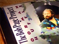
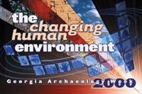
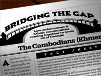
Click here (or on the photos) to see a gallery of print images.