Graphic design. For television, and more.
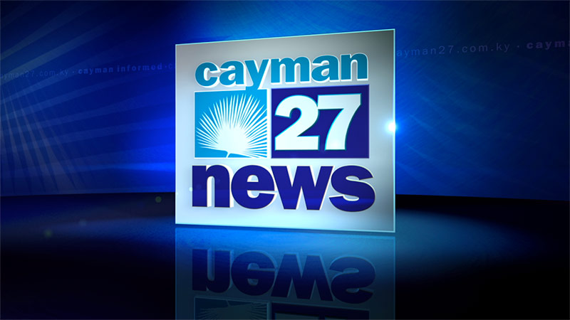
Cayman 27
An island feel for this century.

SuperSiete
Because when you cover all of Puerto Rico, that‘s just super in any language.

A rendering of Atlanta‘s Plaza Theatre.

Carolina‘s News Channel
is WYFF, Channel 4.
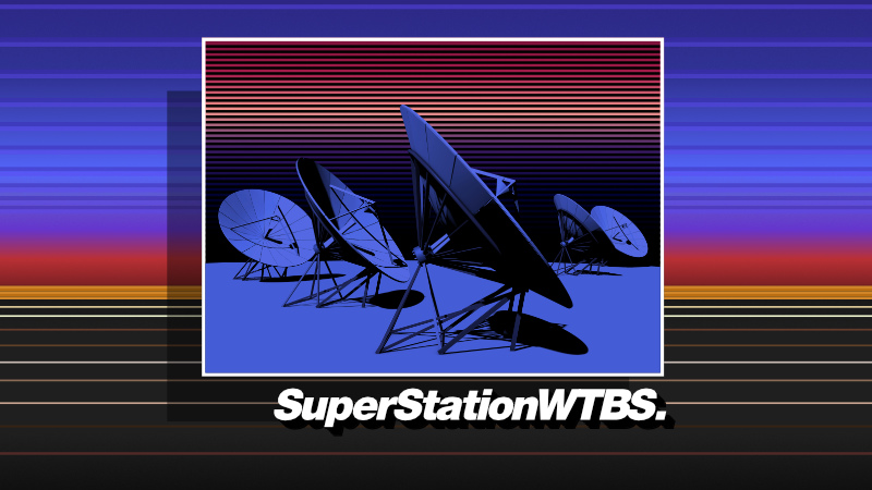
SuperStationWTBS, Cable‘s Most Popular Network.
Or it was in 1981.
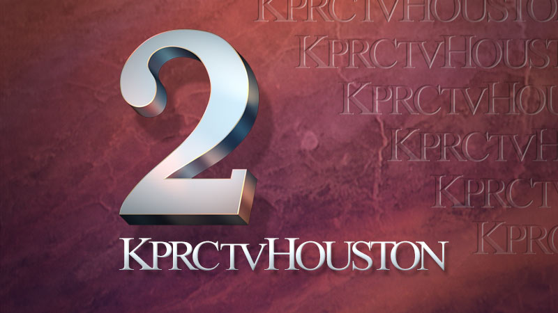
KPRC Channel 2
Long-lived logo design, big as all of Texas.

First News on Fox
Extending the news brand across multiple channels.
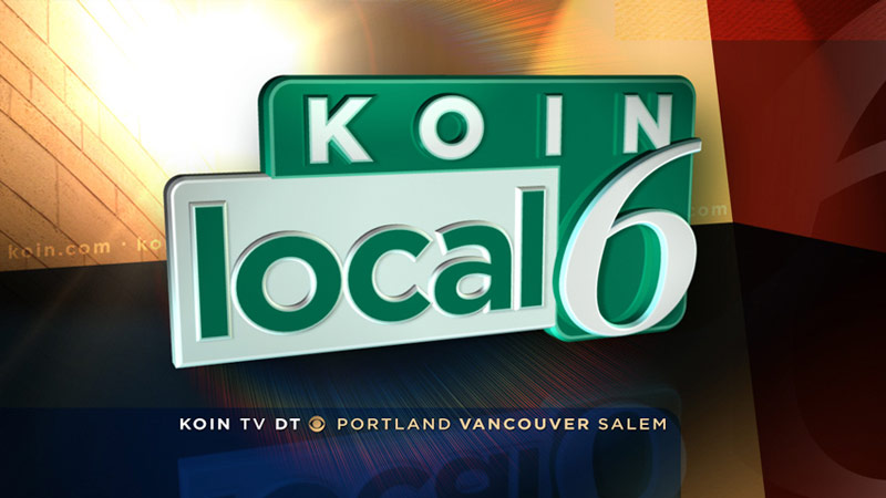
KOIN Local 6
A channel identity that felt like Portland.

Quad VTRs (Ampex 1200Bs, to be precise) from the dawn of television.

Verizon FiOS1
A 3D football game and 24 hour news for NY, NJ, and DC.
Online design
Web design, templates, CSS, JS, and HTML for the modern world.
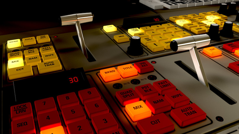
A re-creation of a Grass Valley 300 production switcher, down to the last knob. Analog! NTSC!

WTVA 55th Anniversary ID
Serving folks for 55 years.
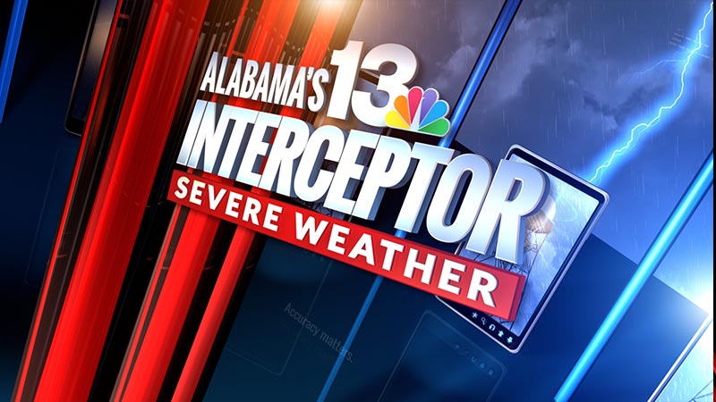
WVTM Birmingham
When severe weather strikes in Alabama, they‘ve got it covered.

Starz
Interactive design for set-tops everywhere.

WKRG Mobile Pensacola
These days, stations don‘t just want to be watched—they want to be liked and followed.

Being Mary Jane
Gabrielle Union plays a fictional newscaster at a 24 hour cable news network, and when they needed set backdrop graphics that looked authentic, I got the call.

33 WYTV: We believe in this valley.
Industrial-strength design for Youngstown.

News 8 Austin
Back when Time Warner Cable wanted their 24 hour news channels to have a distinctive look in each market, this felt like Austin to me.
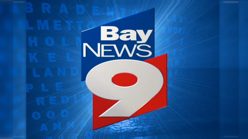
Bay News 9
Your news, all the time for Tampa Bay.
\n
WKRG Mobile
Local television in the age of handheld devices.

A re-creation of a Grass Valley 300 production switcher, down to the last knob. Analog! NTSC!

WVTM Birmingham
Alabama‘s 13 is a channel at home on all devices.
- for television (in any standard, any definition),
- for user interfaces large and small,
- for the world wide web,
- for print, for CD covers, for menus down the street so we get free food,
- for non-profits we’re friends with,
- for passers-by who flash large denominations of cash our way,
- for friends of friends,
- against our better judgement,
- and so on.
Please enjoy a one-minute or so reel of some of jcbD's
television-like stuff on YouTube or on Vimeo.
or call 404-492-7567 voice,
or ping @jcburns on twitter, instagram, flickr…
38 years of designing, thinking, learning. Images are copyright ©2025, jcbD. All rights reserved.